Summary
As part of launching a new mobile onboarding experience, I redesigned how renters move from learning about their insurance requirement to choosing a path, completing the task, and understanding what happens next.
This work went beyond porting existing screens. It included restructuring the flow, introducing new mobile patterns, improving upload guidance and feedback, and connecting outcomes across systems.
Impact
Overview
Renters insurance was a critical part of the move-in process for both renters and property managers. However, the experience was fragmented, hard to follow, and not designed for the realities of mobile. Users needed to understand why coverage was required, decide whether to buy a policy or upload their own, and then trust the system to tell them what came next.
I led the design of a guided onboarding experience that moved users from education to action with clearer decision points, stronger feedback, and patterns built for a new mobile product while still aligning with existing web and property management workflows.
The Problem
The previous experience treated insurance like a task to complete instead of a decision that needed context. Important information was either buried, delayed, or disconnected across surfaces.
For renters
- They did not always understand the requirement or their options.
- The buy versus upload decision lacked enough guidance.
- Upload results could feel unclear or delayed.
- Mobile interactions were harder than they needed to be.
For the business
- Drop-off at key moments in onboarding.
- Incorrect uploads that required more review.
- Disconnected communication across systems.
- Pressure to build new patterns while the design system was still emerging.
Goals
Key Insight
Users were not just struggling to complete the flow. They were struggling to understand what was required of them before they ever took action.
That shifted the design strategy. Instead of optimizing isolated screens, I focused on building a guided experience that created clarity before users had to make a choice.
Designing the Experience
The final experience was structured around a clear progression: understand the requirement, choose a path, complete the task, and receive feedback.
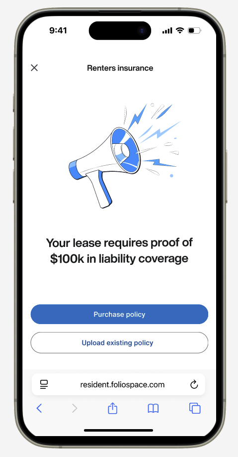
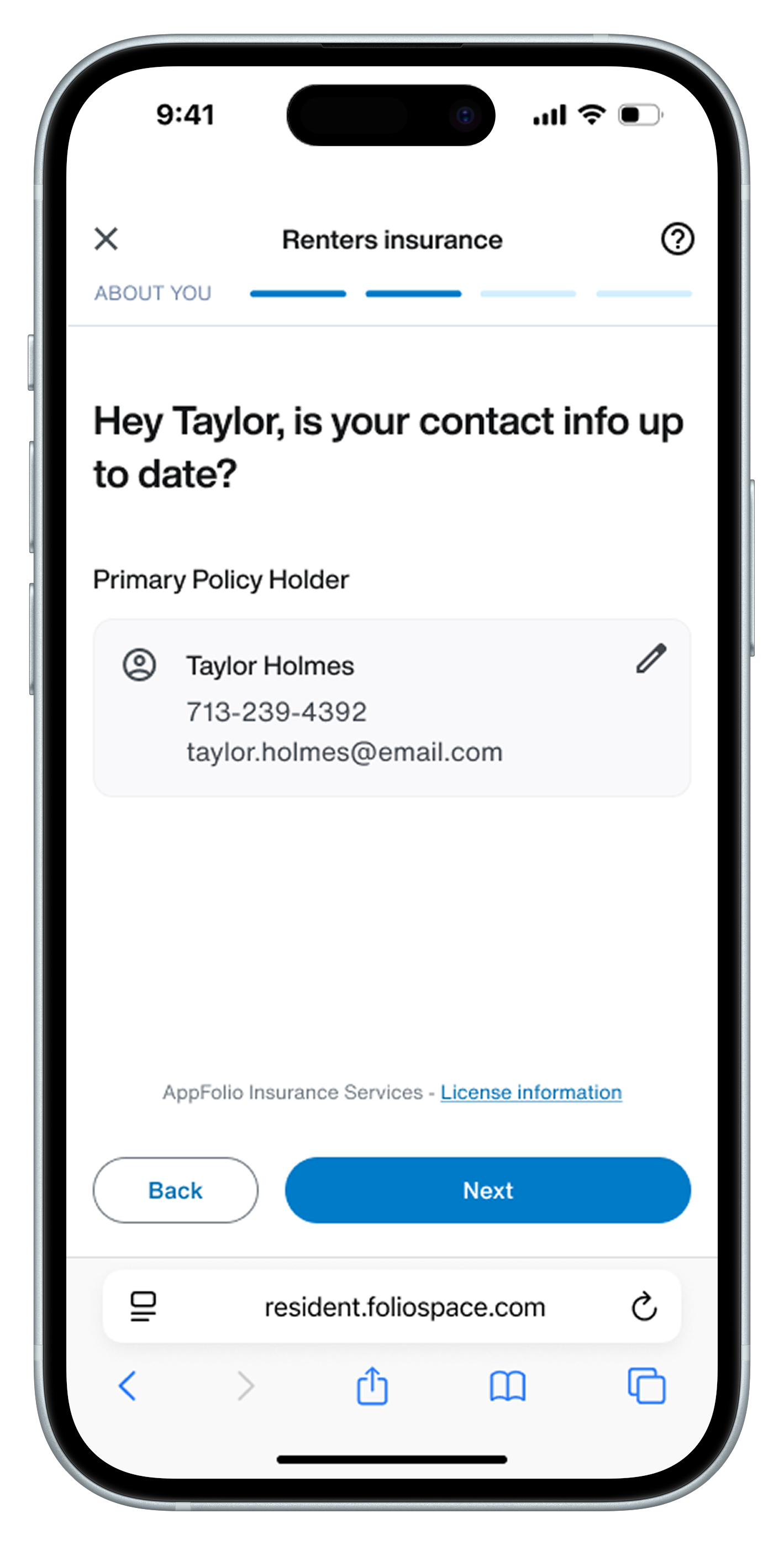
Helping Users Understand and Choose
The first step combined education and decision-making into one clearer moment. Instead of forcing users forward before they understood the requirement, the experience explained why coverage mattered, what counted as valid, and what options were available.
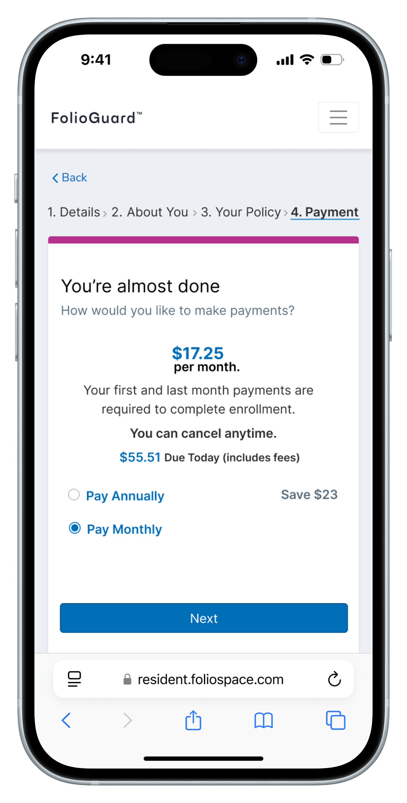
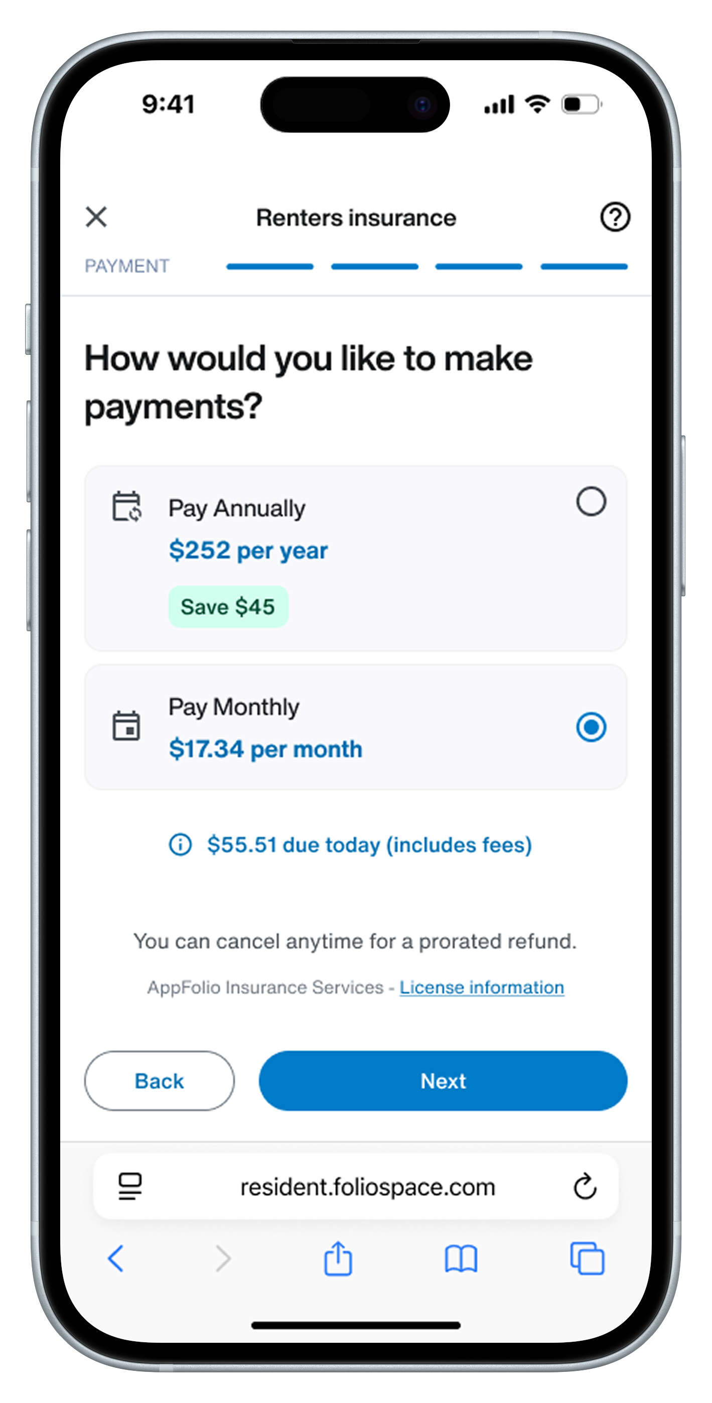
Adapting a High-Performing Purchase Flow for Mobile
The purchase flow had already been iteratively optimized over time through A/B experimentation on a responsive web experience. While it was technically accessible on mobile, it wasn’t designed specifically for how users interact in that context.
Rather than redesigning the flow from scratch, the challenge was to adapt a high-performing experience into a mobile-first one without losing what made it effective.
I focused on preserving the elements that drove performance while adapting the experience to feel natural and usable on mobile.
This included:
- Simplifying layouts to reduce cognitive load.
- Restructuring content for better hierarchy and scanning.
- Adjusting how pricing and details were revealed.
- Ensuring primary actions remained clear and accessible.
Rather than replicating the responsive experience, the goal was to make it feel intentional and optimal for mobile interaction patterns while maintaining its effectiveness.
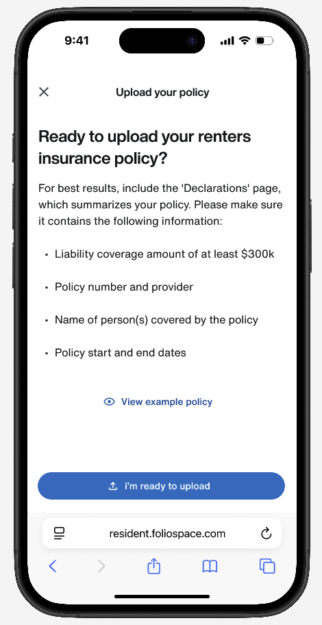
Designing a Clearer Upload Experience
Uploading proof of coverage was one of the highest-friction moments in the overall experience, and it did not yet exist in the mobile app.
As part of this work, I designed the upload flow from the ground up, ensuring it integrated seamlessly into onboarding while addressing common failure points from the existing web experience. View the upload flow case study.
Designing for Required Compliance and System States
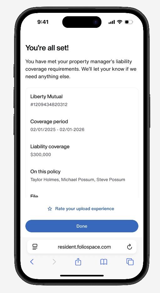
Insurance was not optional in this experience. Residents with a requirement set by their property manager needed to provide approved proof of coverage in order to continue onboarding and access their portal.
This introduced a critical constraint: progress through onboarding depended on the system confirming compliance.
To support this, I designed clearer, state-driven feedback throughout the experience so users always understood:
- Where they were in the process.
- What was currently happening.
- Whether any action was required.
This became especially important in multi-occupant units, where a resident’s compliance could depend on policies submitted by other tenants.
To reduce confusion across both residents and property managers, I introduced a shared set of system states:
- Under review: policy is being processed.
- Action required: issues were detected and need to be resolved.
- Covered: requirement has been successfully met.
These states ensured users were not just completing steps. They were understanding their status in real time.
Maintaining Continuity Across Onboarding, Portal, and Communication
Onboarding was not the end of the experience. It was the entry point into an ongoing system. Once users completed onboarding, their insurance status needed to remain clear and actionable across:
- Their online tenant portal
- Email communications
- Property manager workflows
I aligned messaging and states across these surfaces so that:
- The status shown during onboarding matched what users saw in the portal
- Follow-up emails reinforced the same outcomes and next steps
- Property managers and residents were operating from the same understanding
This continuity was especially important for cases where:
- Policies were still under review
- Issues were detected after submissio.
- Coverage depended on other occupantsw
By carrying the same system states across onboarding, portal, and communication, the experience became more than a flow. It became a shared source of truth for everyone involved.

Reflection
This project reinforced that onboarding is not just about getting users through steps. It is about helping them understand what matters, why it matters, and how to move forward confidently.
It also showed the value of designing flexible systems. The strongest parts of the work were not the screens themselves, but the structure underneath them: clear reasoning, intentional decision points, and patterns that could stretch across products and platforms.