Introduction
Uploading proof of renters insurance is a critical step for lease compliance, but the experience is often confusing, error-prone, and requires manual review. I led the redesign of the insurance upload experience to simplify a complex, data-heavy workflow into a fast, intuitive process that provides instant feedback and improves submission success.
This work resulted in a 17% increase in valid submissions and reduced friction for both residents and property managers.
The Problem
Users were submitting insurance documents that often failed validation due to unclear requirements and delayed feedback. When a submission was invalid, users were not given enough information to understand what went wrong or how to fix it, leading to repeated uploads, confusion, and increased support from property managers.
Designing for Two Audiences
Resident pain points
- Unclear requirements and consequences.
- Confusing terminology.
- No real-time feedback about their policy.
Property manager pain points
- Frequent invalid uploads.
- Manual review burden.
- Misaligned expectations.
We collaborated closely with internal teams to map out not just the resident journey, but the behind-the-scenes workflows of property managers who needed to act on the data. Our design needed to ensure that statuses were up-to-date and clearly communicated across systems.
Improving Resident Understanding
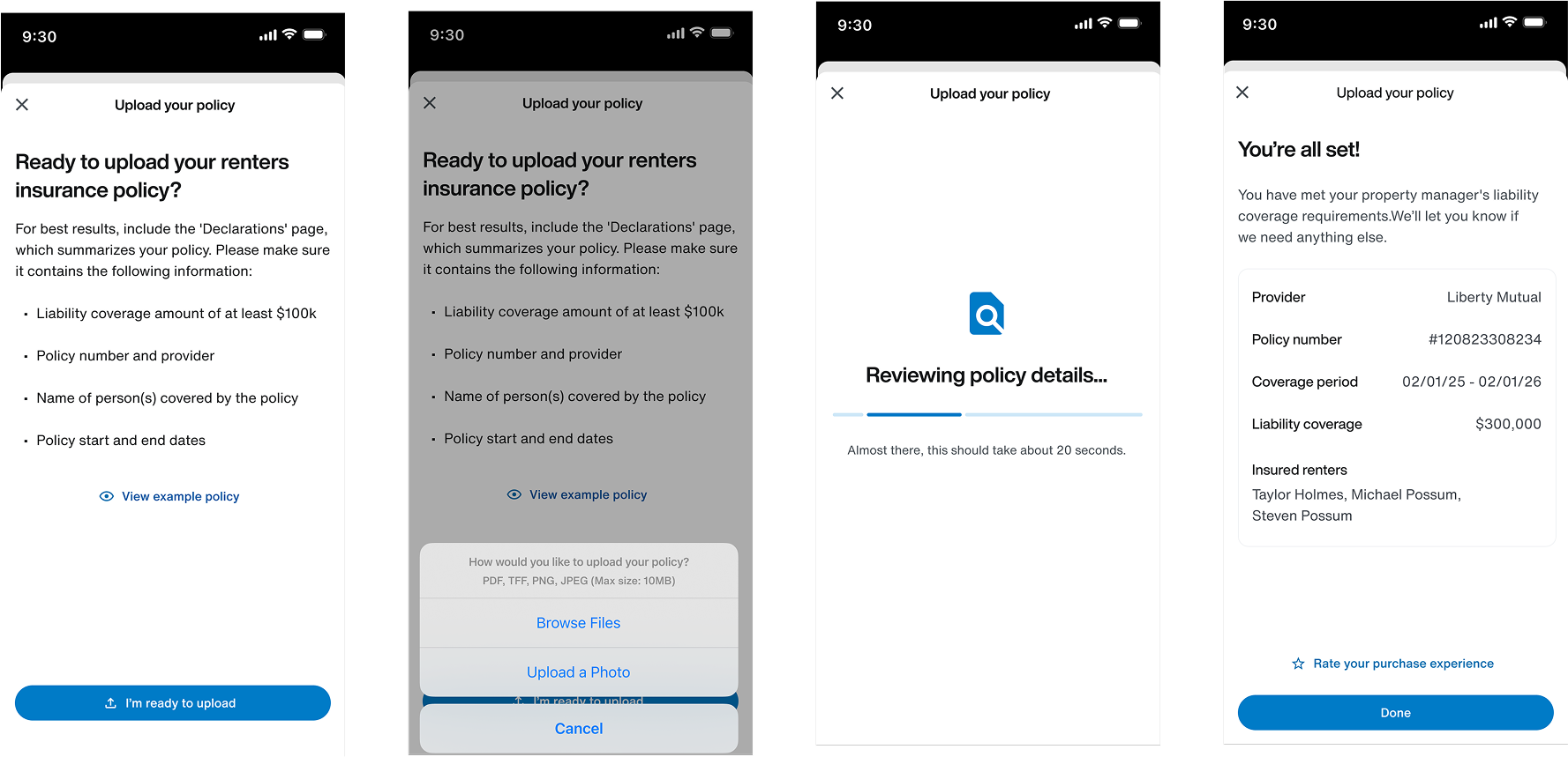
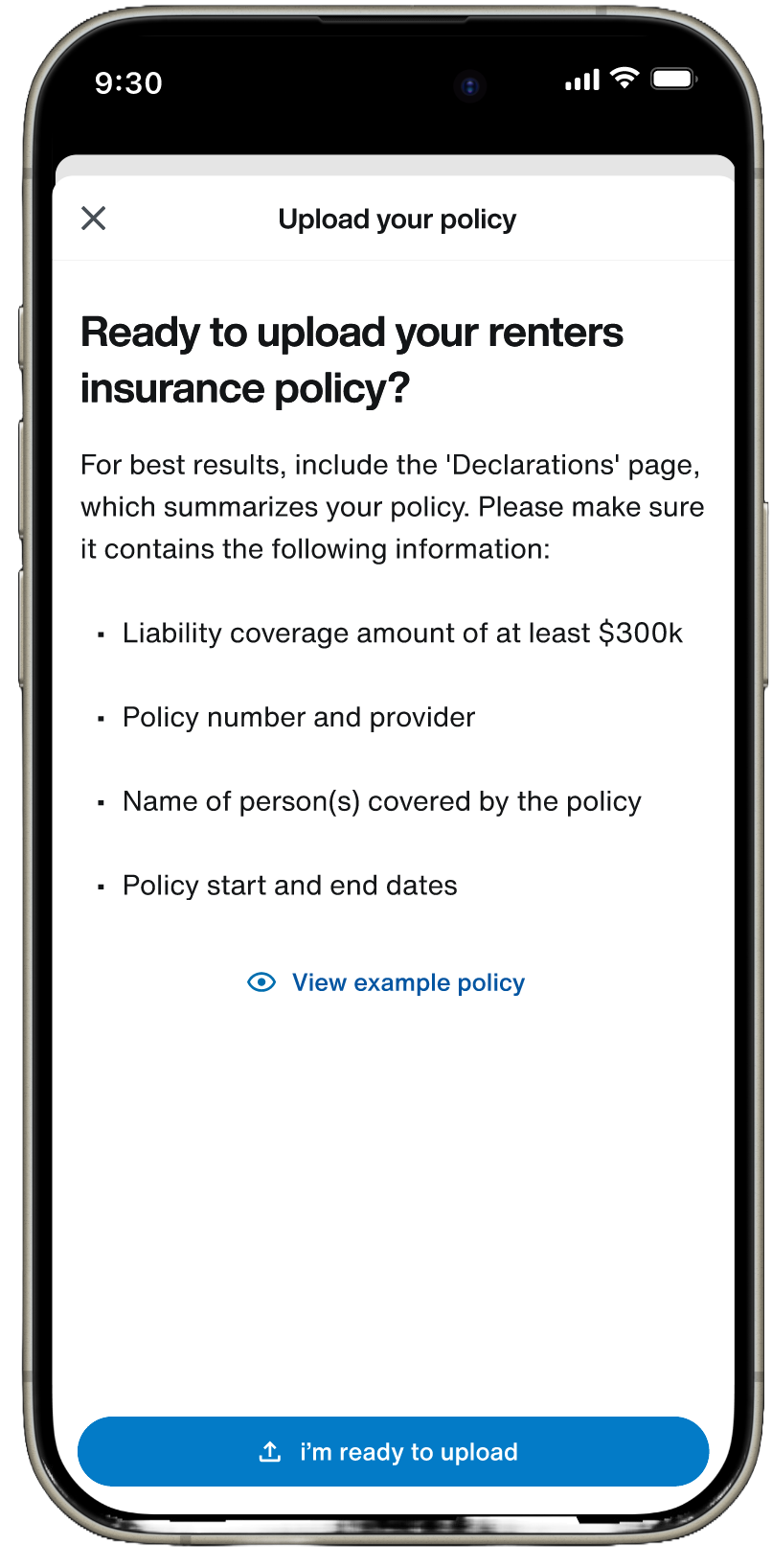
A key driver of invalid submissions was lack of clarity around what qualified as a valid policy. Instead of relying on post-submission errors, I introduced guidance before the upload step to increase first-time success.
I designed an instruction step that clearly outlined required fields such as policy number, coverage limits, and dates using plain language and visual examples. This shifted the experience from reactive error handling to proactive guidance while supporting both file upload and camera capture.
Designing for System Constraints
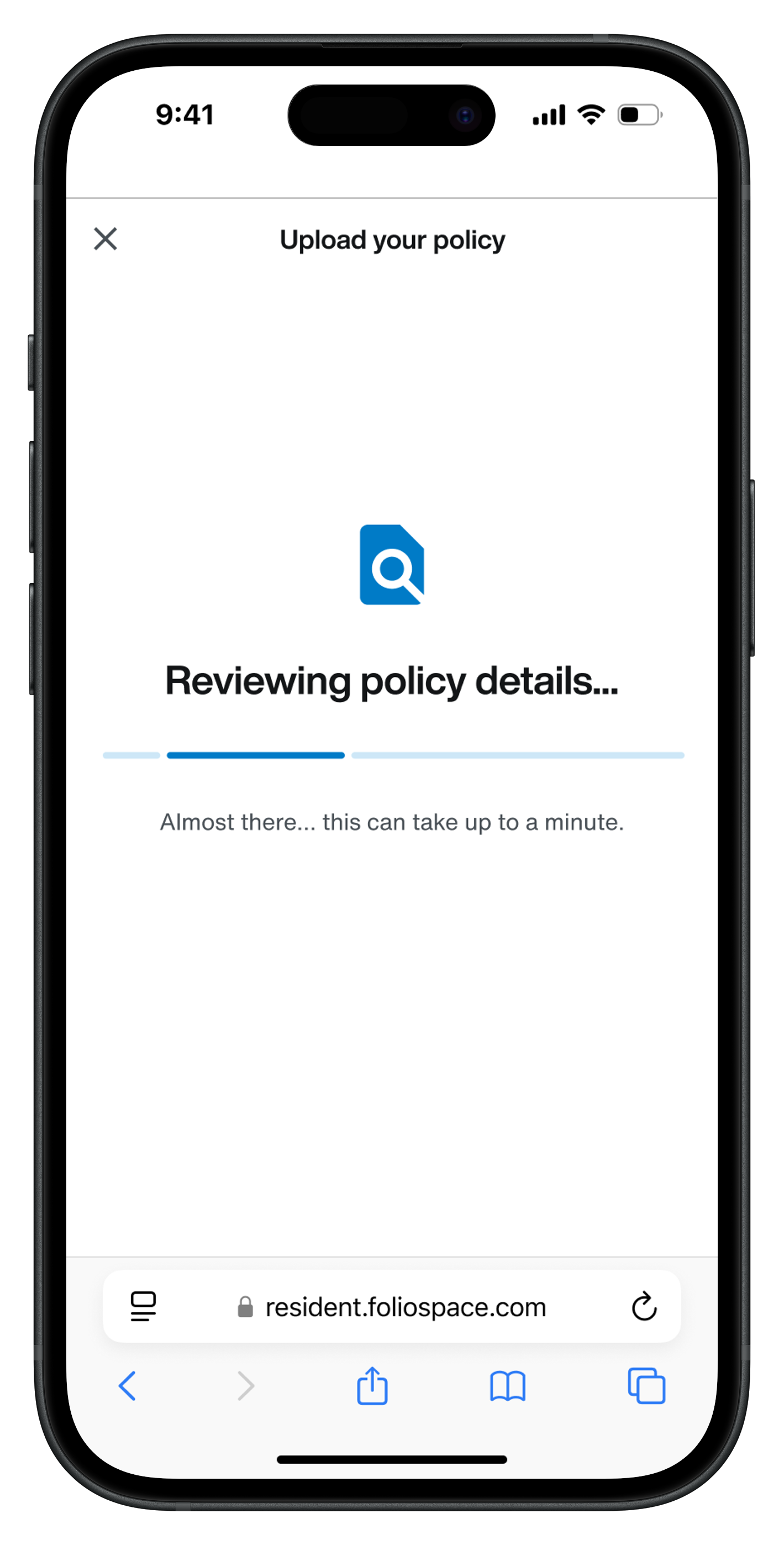
The upload experience depended on an asynchronous scanning system, where validation results could return immediately or be delayed.
Designing for the Wait
A key part of the experience was designing the waiting and loading states that appear while our system scans a submitted policy. These screens needed to give residents visibility into why the process was taking time, make the wait feel less painful, and encourage them to stay on the page long enough to receive a result.
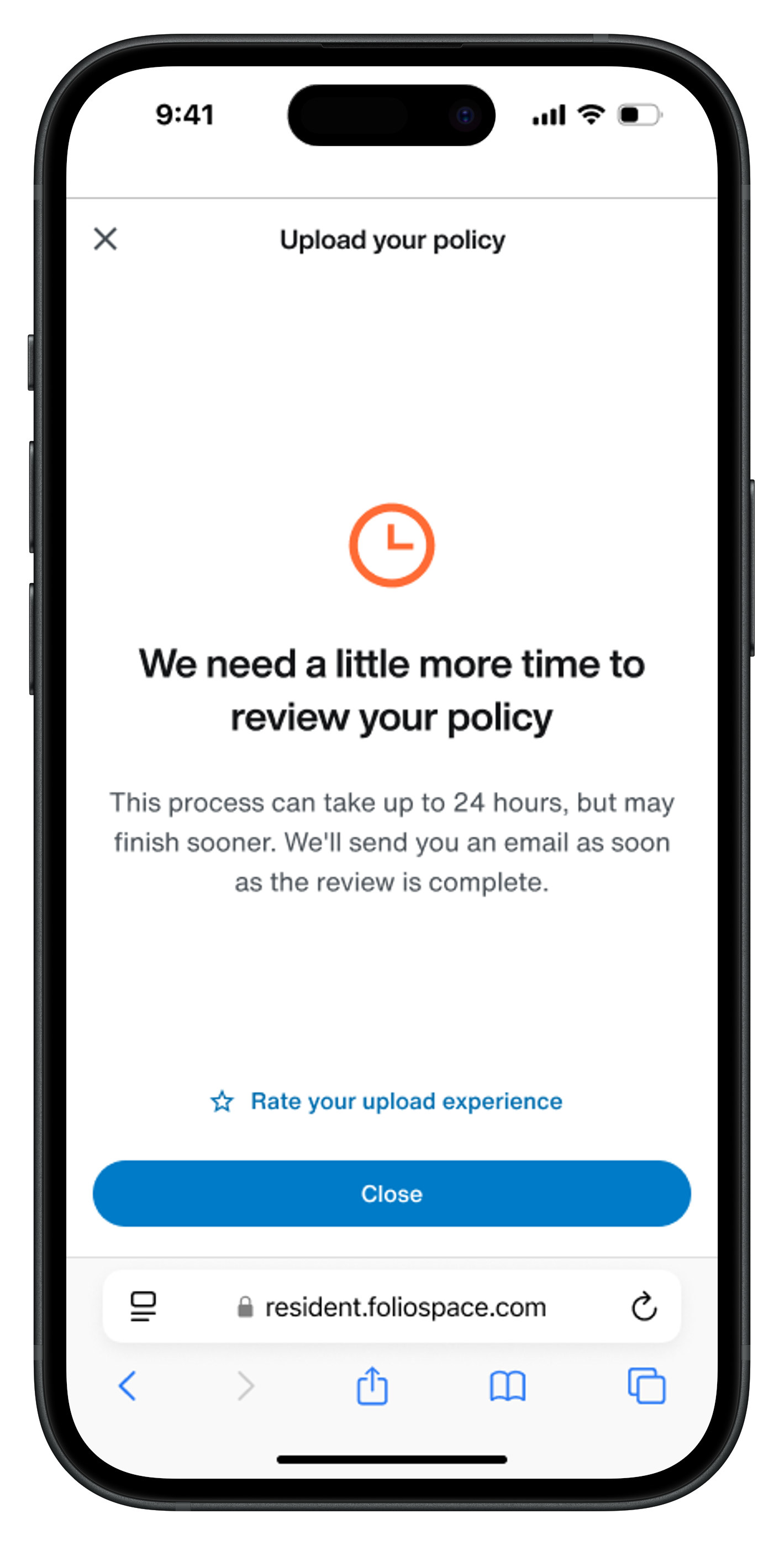
Originally, the system waited about 20 seconds before falling back to a generic “we will get back to you” message. In practice, that was not enough time. Users frequently hit the fallback state, which created frustration and made the system feel slower and less reliable than it actually was.
This became even more important when the insurance requirement needed to be completed during onboarding in order for residents to move forward. If users hit an ambiguous waiting state at that moment, the friction was much higher because they were blocked from progressing.
I updated the wait threshold to one minute based on existing scan-time data, which showed that the large majority of scans completed well under that window. That gave the system enough time to finish in most cases while users were still present, so results appeared faster from the resident’s perspective even though the actual scan time did not change.
Results and Reflections
The redesigned upload flow led to a measurable 17% increase in valid submissions and a noticeable decrease in manual outreach required by property managers. Residents felt more supported and informed, and PMs appreciated the clarity and consistency of results shown in their portal.
This project reinforced the importance of designing for both ends of a workflow and the value of embedding education directly into key moments of action.